Logo Rebuild - Illustrator
Wednesday, June 24, 2009
Friday, April 3, 2009
Project Management/Scheduling
This post is about developing skills in managing projects and meeting deadlines. What you have to do once a deadline is given is to work backwards from that deadline. Take into account all the steps and processes you have to accomplish to meet the deadline and assign yourself a date/time where each stage must be accomplished. This gives you a complete timeline for your project and if you meet each point along the way, you shouldn't have problems. Remember to build into that timeline some slack to allow for potential problems. Production problems, changes in the project and a host of other difficulties tend to crop up towards the back-end of projects. The closer to a deadline you get the more likely problems will happen. Learn to anticipate problems. Don't miss deadlines!
To relate this to your current deadlines... you need to get your .pdf of your Ride poster submitted to the print monitors by Monday. Tuesday should be your fall-back time to reprint the project if you had problems printing on Monday.
Thursday, April 2, 2009
Design early and often
When taking a comp into production you probably experienced the desire to make changes to the layout, because the design is not translating well into the computer and needs something not thought of earlier in the thumbnail or comp stages. But, you are restrained in doing so because the client has already approved the layout you are assembling. If your layout really sucks, you need to work to make it better, it just means you have to submit these better ideas for approval by art directors, creative directors, account executives and the client. Don't be afraid to suggest something to make a design better. That is the ultimate goal... to produce exceptional work. If can sell your supervisors on the alterations, it is their job to get the approvals on the changes. Don't let the process dictate quality. But, to be efficient in the process, you have to design early in the process so alterations aren't needed at the back end.
When introduced to this design process of conceptual development, thumbnails and comps, students have a tendency to delay creative and visual decisions until they can get on the computer. The computer seems to be a security blanket. But the real design takes place in the grey matter between your ears early in the process. The markers and technology only translates what is in your mind onto paper. You need to keep in mind when thumbnailing and comping how you are going to assemble the layout on computer. Experimenting visually and designing variations takes much less time at the thumbnail stage than it does on the computer. Use this stage to your advantage.
Friday, March 27, 2009
Spiral Sperm Special
Wow, what a deal! The beauty shop that advertised this didn't think so when the ad with this headline ran in a local publication. What the nice ladies at the beauty shop wanted to advertise was a Friday Spiral Perm Special. But, they were victims of the eternal, never-ending battle that exists in marketing, advertising and design - typos in the copy. One little slip on the keyboard and the beauty shop was getting all sorts of phone calls about this special. I don't think it was from their normal clientele. Actually, maybe it worked. OK, we won't go there.
In the days prior to computers and designers setting copy, the typesetter was a buffer in avoiding typesetting errors. Typesetting companies had internal proofing processes in addition to the proofing stages that exist internally in an agency or studio. Copy would be proofed multiple times before going to print. Today, that typesetter buffer to protect a designer and/or agency from typos no longer exists. So, it is very important for you and the organization you work for to proof all copy carefully. You should proof everything multiple times. Be paranoid to the extreme. Typos cost you or your employer money and loss of reputation. Make sure when the final art is being approved by the client, that they understand they also have a responsibility in making sure there are no errors in the copy.
Tips on proofing copy
1. Find a quiet place and time to proof. Don't proof with someone hovering, waiting for you to get done.
2. Read the copy slowly and carefully.
3. Read the copy backwards from the end of the copy to the beginning. This forces you to break down the copy word by word.
4. Get other people to proof the copy. They will see things you will miss, since you are too familiar with the project.
5. Create a sign-off process of all those responsible for the accuracy of the project. Get signatures! Cover your butt.
Thursday, March 26, 2009
I channeled Elvis - I just had to.
When I was first building my freelance business, I had one primary client - a regional bank. This client made up most of my annual billings for the first couple of years. The Marketing Vice President of this bank was very active in developing advertising materials and organizing events for the employees throughout the year.
Once she had scheduled a big retreat for all the bank managers and she had me busy designing a whole range of collateral materials for this event. She had a big venue reserved, entertainment, food and activities planned. As the big day approached, I thought my part in this event was complete. But, at the last minute one of her scheduled entertainers for the event cancelled. It was an Elvis impersonator.
Now, I had worked with this Marketing Director for many years and she knew that I liked to try to impersonate Elvis... "Thank you very much!". That was my first mistake. Guess who she asked to stand in? That's right, me. As my largest client, I couldn't say no. So I did what any struggling business owner would do - I said I would do it. Not only did I have to wear a 70's Elvis jumpsuit and Elvis wig, I had to sing Viva Las Vegas with a Karaoke machine to a very large group of bankers. It was bad, yet painfully funny. I am probably the only nine-fingered Elvis impersonator on the books. It was my one and only performance. But, I earned by client's eternal gratitude (my respect ratio I'm sure took a hit) and assured myself at least another year of design work from this client.
The reason I'm blogging about this is to let you know that you will be expected to do many things for a client that falls outside of your specialty area of graphic design. You may have to write copy, you may have to take your own photography and do creative presentations to sell your ideas or even do impersonations. There will be times when you have to bail your clients out of a jam. So, be ready to step up and be the go to person and look like a hero.
Wednesday, March 25, 2009
My days as a Stripper
Just another note about the changes that computers have brought to graphic designers. Initial entry-level jobs in the graphic arts typically were that of a paste-up artist. That was my first job in the industry. Today, a graphic artist will take an approved marker comp to final art production in InDesign on the computer. Paste-up artists would produce the mechanical art boards that were used by pre-press technicians to produce plate-ready negatives in a photo-mechanical process.
It is these mechanical art boards with the text pasted onto the base art board and the various layers of acetate overlays, and Ruby and Amberlithe that the pre-press technicians would shoot on those big vertical and horizontal stat cameras. Each layer of the mechanical art would have to be photographed in negative and then stripped together. Remember, I told you that I used to be a stripper. Tell your parents you have an ex-stripper teaching your class - see if that gets their attention.
The stripping process required taking multiple negatives of text, images and masks and assembling them together. Strippers and camera operators were very, very detailed oriented people that knew a lot about photographic "special" effects. The end goal was to get a composite negative for each color used in the design to make a printing plate. This is what the old guy in the movie Helvetica - who was it?, was talking about as being so difficult in the days prior to computers. The designer and paste-up artist didn't see what the design actually looked like until a blueline, color key and/or Match Print proof was made from the composite negatives. You had to be very good at visualizing a design in your mind and you relied heavily upon the marker comp. That is why comps had to be so accurate in representing the design. It was all you had to go by visually until the proofs arrived.
On Friday I'll bring in a small mechanical paste-up board to show you what a production art mechanical board looked like in the days before computer.
This is so Old School
Yep, thumbnails and marker comps are indeed old school. The computer has replaced much of the drudgery of layout that existed before computers were integrated into the design process. Comping was rather tedious day in and day out. Thumbnailing ideas is still utilized extensively... the process is a fast way of visually getting ideas onto paper. But the full-blown marker comp has been diminished in layout process.
Comping skills are still in high demand for story boarding commercials and scenes in motion pictures or to conceptualize something that doesn't yet exist. Comping has become a specialized skill set. Not many designers can do it well any more.
To do thumbnails and comps in a design process is a way for me to reinforce in your mind that YOU are the designer, not the computer or any of the technology currently utilized today. Computers will not make a better design just by using them. There is no "Make good design" button on the keyboard or in the drop down menus. You are the creative factor and you can be creative and design with or without computers. A good design hinges upon creative application of the basic design principles and elements. Those principles and elements should also be included on the tatoo list.
Copy Markup
This is an FYI as to how to read type mark-ups. Since designers are now essentially the typesetters, this mark-up language isn't utilized to the extent it used to be when a designer had to communicate to a typesetter. Today, production artists assembling layouts on a computer for a designer or art director may be directed using this markup language.
EXAMPLES
12/14 [18 Times Reg.
This means 12 point type, 14 point leading, Flush left in a column 18 picas wide, set in Times Regular.
13/18 [24] Helv. Bld.
This is 13 point type, 18 point leading, Justified column, 24 picas wide, set in Helvetica Bold.
Copyfitting Recap
Wow, what an exciting and informative demo today on how to copy fit text.
For those of you whose eyes were spinning as I was doing my demo, here is the overview.
Tools needed: A pica pole, a type gauge, a calculator, triangle, T-square, paper and type specimen book.
Step 1: Have hard copy printout at 12 pt. Courier, Double-spaced. Determine how many characters are in a paragraph of copy. Pick three lines in the paragraph (short, medium and long line) to get an average Character Per Line. Multiply the average CPL by the number of lines in the paragraph for a total character count in the paragraph.
Step 2: Using the type specimen catalog pick out a type style that you want to use. Also pick out which point size you want to use. In the graph under the point size you want to use find the Character Per Pica number for the Lower-case alphabet.
Step 3: Determine the width of you column of text you want in your layout(measured in Picas).
Step 4: Multiply the column width by the CPP of the typeface to give you a CPL for the typeface at a given point size.
Step 5: Divide the total character count of the paragraph by the CPL to find out how many lines of copy will exit at a given width, in a specified typeface and point size.
Draw this out as a rough pencil sketch to use as a tracing template for your comp. You do this for each paragraph of copy you want to use in a layout. You need to practice this several times to get the hang of it. You will be copyfitting in an upcoming project, so know how to do this.
Friday, March 20, 2009
I'm such a tool
You are going to feel very frustrated as you learn to become a graphic designer. You have just experienced one of many frustrations. You have to take to completion one of the layouts that may not have been your choice. Someone else got to choose. The design process has many frustrating obstacles to overcome. Often, it will seem like you never get to do what you want to do. You will feel like you are only a tool in the grand scheme of things. In fact the approval process can seem like it is designed to wring every ounce of creativity out of a project. This is a risk in the process. Too many cooks in the kitchen maybe? A good idea or design can be altered and watered down to a point of ineffectiveness. You will have to learn how to manage and overcome these inherent problems with the process. This will come with experience. Butt-kicking concepts and design is one of many ways of avoiding the problem.
But... when a client doesn't approve a design, asks for revisions, or offers suggestions... this means your design didn't solve the problem effectively. It didn't sell. You pick up what is left of your self-esteem, cry in the car on your way back to the office or bar and start over to resolve the problem. Fun isn't it.
Wednesday, March 18, 2009
Plan for Problems - Cover your Butt
As a designer and/or production artist, you are one of the later stages in the life of a visual communications project. The account executives, research teams, creative teams and copywriters will have a project long before it lands in your lap to design and execute. This means deadlines will be tight for you and stress levels high. This also means that the risk for any potential problems will be magnified by the time you get the project. The closer you are to a deadline... the potential for problems grow exponentially. Anticipating problems will be a skill you need to develop. Primarily in production art, you need to have a preferred plan (Plan A) and a backup plan (Plan B and/or C) in case Plan A falls apart. The reason is to ensure that you hit the deadline no matter what. As an employee, if you are lucky, you will be allowed to miss a deadline only once or twice. Missing deadlines means lost income. Lost income means you will probably be unemployed.
As a student this skill can be best developed when you are trying to get your final ink-jet printouts produced. Consider all that could go wrong in our in-house process and plan to avoid the problems. Have a back-up plan. It will save your butt, you'll meet the deadline and look like an A student.
Tuesday, March 17, 2009
Copyfitting
Upcoming design process projects are going to require knowing how much room a given amount of copy will occupy in a layout. We will continue with the marker comp process of design and layout prior to moving to a computer for final art production. This means you will have to figure out (by hand - without the computer) how much room is needed for copy in the layout comp. This is called copyfitting. I want you all to do a bit of research on the web as to how this is done. There are multiple sites that will explain it. I also have resources as to how it is done. So, figure out how to do it and be ready to use it when we get to the layouts with large blocks of copy to integrate into a comp design. Blog about it so I can see your progress.
Concept is King
I don't think I stressed this part of the process enough on the Chili poster project. You need to spend an hour or two just brainstorming ideas related to the project topic and take into consideration the parameters of the project. Create a list and write down any and all ideas - what direction do these ideas take you? At this point, it isn't visual. You visualize your concept in the thumbnail sketches - the next step in the process. You are looking for a creative way of approaching the problem. Don't rely on your initial ideas, push them and expand upon them. If you can develop a strong concept, your design efforts will have purpose and be a whole lot easier.
Whatever you do - Don't bleed on your layout!
Since we are going to be doing more hand sketching, comping and mounting processes... it is inevitable while working with Xacto knives, trimming and prepping your layouts, you will inflict some sort of a cut or gash upon a finger. A true professional will avoid, at all costs, bleeding upon the layout. You will have spent a lot of time on these comps and to ruin them with a blood splatter means you would have to re-comp. Not good. sucks actually. Be very careful when using the Xacto knives. Keep a sharp blade in it. A dull blade is much more dangerous than a sharp one and watch for nicks and chips in the plastic triangles. The knife can hit those nicks and jump up on the top surface and come after your finger. I know, I have an inch long scar on my finger - took 9 stitches, one stitch more than my amputated finger - but I didn't bleed on the layout I was prepping for presentation. A badge of honor. Who wants to join the club?
Friday, March 13, 2009
God is in the Details
My first job as an Art Director in an advertising agency was a great learning experience. I was hired as an Art Director/Graphic Designer. Sounded good. It just meant that I was the only artist on staff, so I was responsible for everything visual. The co-owner of the agency (who became a close friend) was very picky and quickly discovered my lack of "paying attention to details". One big gap in my experience was being able to design (by hand) and comp an accurate layout. I was too sloppy. He was very patient while my skills developed and would tell me that "God is in the details" and send me back to the drafting table to redo the layout. He was right. As a designer, you have to have an answer to every little nuance in a design. Why did you choose a specific typeface? Why is the headline set at a specified point size? Why does the photograph go there? Why did you pick that color? Layout and design is not a linear process. It is a circular process of layout, revision, layout and revision. The decisions you make in a design should visually convince/sell the Account Executive or client. If you don't have a reason when they question your design then they send you back to try again. It is not personal when a design is rejected. You simply haven't found the correct visual solution.
Thursday, March 12, 2009
Wednesday, March 11, 2009
Sunday, February 22, 2009
Old School Design - Pre-computer
Here are a couple of images I found of typesetting from the past. One is of ladies setting type by hand and the other is a mechanical typesetting machine. It was quite a beast, but it sped up the setting process considerably. Also, I found a site on the web describing what graphic designer and typesetters had to do before computers were introduced into the work flow. Typesetting and Layout
Horizontal Stat Camera
Here it the mechanical drawing of the horizontal Stat camera. This unit was very large and required three of four times the amount of space than that of a vertical camera. As I said in class, the back portion of the unit was typically in a darkroom and the lights and copy plate were out in a lighted room. They both essentially did the same thing, just the horizontal had a larger reduction and enlargement capability.
Both units could produce either positive or negative, paper or film. With the advent of computers and Desktop Publishing, this type of equipment was rendered obsolete.
Vertical Stat Camera
Here is the mechanical drawing of the vertical Stat camera I was talking about on Friday. This unit was about chest high on me. Had to stand on a little box to view the image on the glass positioning plate. You would key in the amount of exposure and adjust for enlargement, reduction or same size. The original image/artwork was placed on the lower portion of the unit under it's own glass plate.
Friday, February 20, 2009
Sara Rudder's Sunglasses
Here is a student example of one of the Illustrator/vector exercises. To upload your Illustrator projects to your blog, you have to Export as a .jpg from Illustrator. Then open up the .jpg in Photoshop and convert the image from CMYK mode to RGB. The resolution is set when you export from Illustrator. When this is done, just click the picture icon in the blog posting text window to add the .jpg. Try it out. See if it works.
Thursday, February 19, 2009
The Offset Printing Process
So finally, getting back to the process in design software and process. I'm going to talk about offset printing.
This will be the primary printing process you will be designing for when you are working professionally.
The first picture is a one-color Heidelberg offset lithography press. This unit will print one color of the CMYK or spot color printing I have been talking about in class.
The next is a four-color Heidelberg press. Essentially, four, one-color presses linked together. They can link as many print units together as needed. A six-color press could do the CMYK colors, a spot color and a varnish in
one run. These things are massive. Have been know to eat small children if they get too close.
Both presses are called sheet-fed presses; where a stack of standard-sized sheets of paper are fed in the front of the unit and pulled into the press where the image is printed on the paper and deposited at the back of the press.
Four-color printing can be done on a one-color press simply by taking the stack of papers back to the front of the press, wiping down the first color and re-inking the press with the next color and printing the new color. This is a labor intensive process to do on a one color press. So, to eliminate the labor, three additional print units are linked together and the colors are all printed in one run.
Wednesday, February 11, 2009
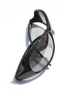
Illustrator - Sunglasses
Rebuild this image of the sunglasses in Illustrator as a warmup to the "Favorite Ride" assignment. You need to open the image up in Photoshop first and save a .tif so you can import as a template in Illustrator to redraw the image using vector tools. Again, NO LIVE TRACE. Use the tools. You will be making a compound paths in this exercise. Make it look as close to the original raster image as possible.
Due next Wednesday.
Subscribe to:
Posts (Atom)